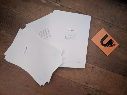
I came home last night to find a hefty package in the hallway... the page proofs of Midland! It's always an exciting moment in the life of a book when these arrive, as it's the last chance the author gets to check over the text. It's both a hello to the book as it's actually going to look, and a goodbye to the work - when these pages go back along with any red marks I make on them, that really is the end of the story from my point of view.
I'll be reading these over the next week or two and the next reader after that will be you, so get ready. In the meantime, you might like to listen to today's edition of Radio 4's In Our Time, which by happy coincidence is about George Eliot's Middlemarch, one of the inspirations for Midland - the two books share a setting and several key themes.
When the time comes, you won't be sent an unruly ream of A4 paper to grapple with, of course. You'll get the whole package bound up in an ingenious new kind of a folder known as a "cover". If you've ever managed to tear yourself away from your phone long enough to walk into of one of the cutting edge new retail environments called "bookstores" that are beginning to spring up in the hipster districts of international cities like London, Tokyo, New York and Berlin, you'll have seen covers in action. These deceptively simple-looking devices allow books to sit on a shelf and be carried around without falling apart. They require no charging or batteries, and they offer an opportunity for an enticing representation of the book's themes and content to be displayed on the front in the form of colourful graphics or photographs known as "cover art".
Cover art is a skill all its own, and Unbound's excellent designers have been working on some ideas for the artwork for Midland. Here are the current two front runners:
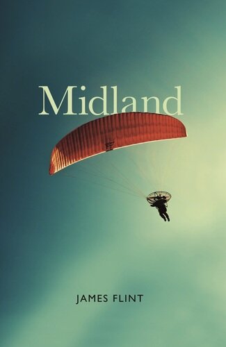
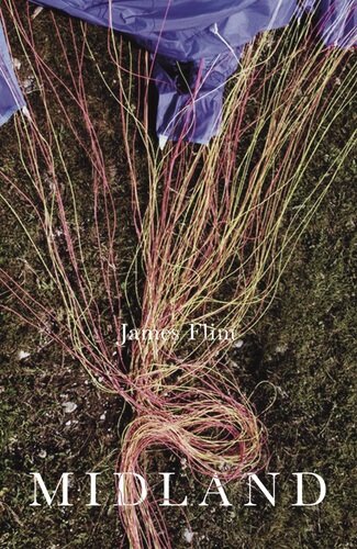
In the first instance I liked the second of these the most - it's a beautiful image, and one which resonates with the book in all sorts of ways - but when I showed the two options to various friends last week, nearly all of them found it confusing, because it wasn't immediately apparent what the picture was of. The overwhelming majority found the first image, of the paraglider, more striking and alluring, which is quite pleasing too, as it was always my own best idea for the image that should sit on the front of the book. I've passed the comments back to the Unbound team, which is working on some new versions. If you have any thoughts, please fire them over, and I'll put them in the mix.